NWEA Map Test Scores Chart by Grade Level in Math 2026-2027 (Quick Lookup)
Most NWEA Map Score Chart guides make you wade through thousands of words and dense tables just to answer one question: is my child’s score good? This page skips all that. Four charts, one glance each, and you know exactly where a Math score lands for any grade and any season, no scrolling required.
NWEA Map Test Scores Chart by Grade Level in Math 2026-2027 – Fall Test
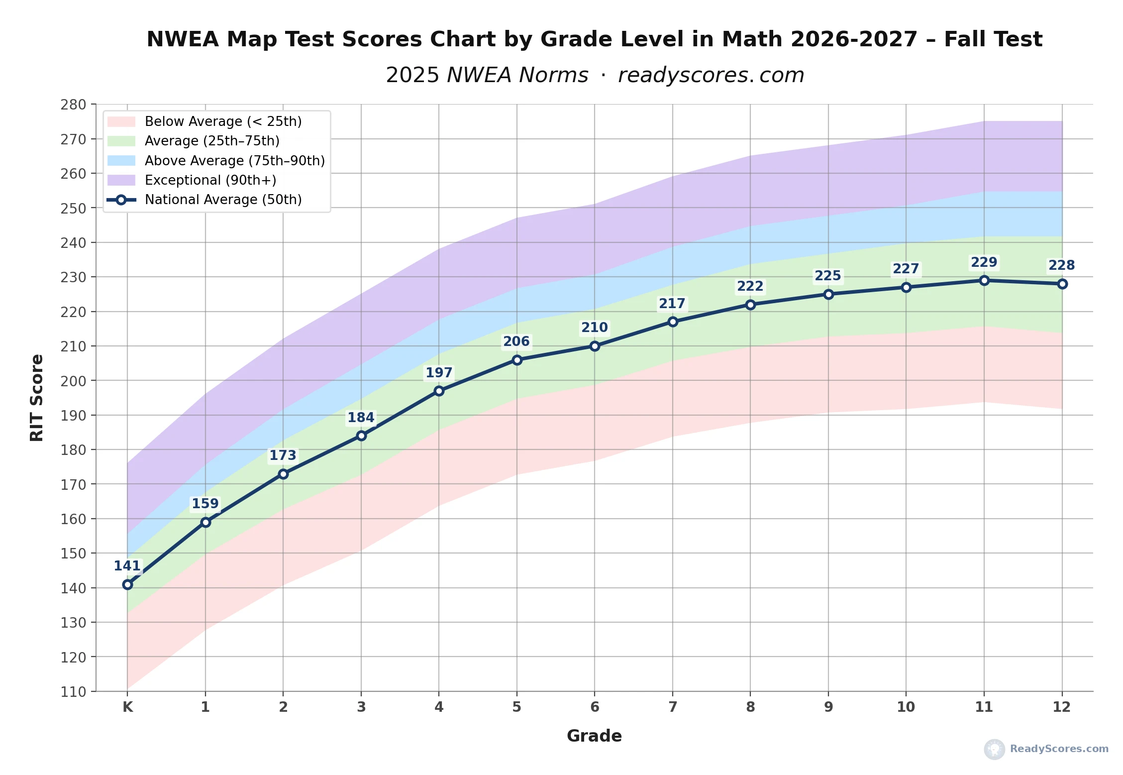
Fall testing happens in September and October, so this chart marks the starting point of the school year. Find your child’s grade on the bottom axis, then look straight up to see where their score lands against the four colored bands. Landing in the green band means an average score, blue or purple means above average, and pink means the score sits below where most students in that grade tested this Fall.
Explore more NWEA MAP score charts and tools:
NWEA Map Scores Charts (by Grade) – Overview
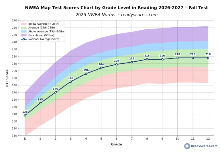
NWEA Map Scores Chart by Grade Level in Reading (Quick Lookup)
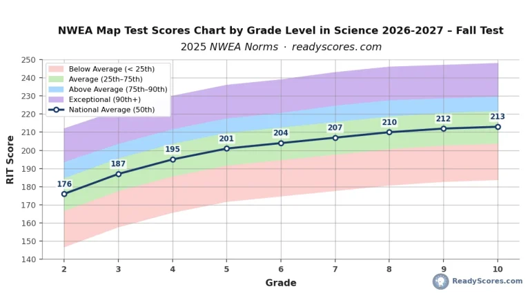
NWEA Map Scores Chart by Grade Level in Science (Quick Lookup)
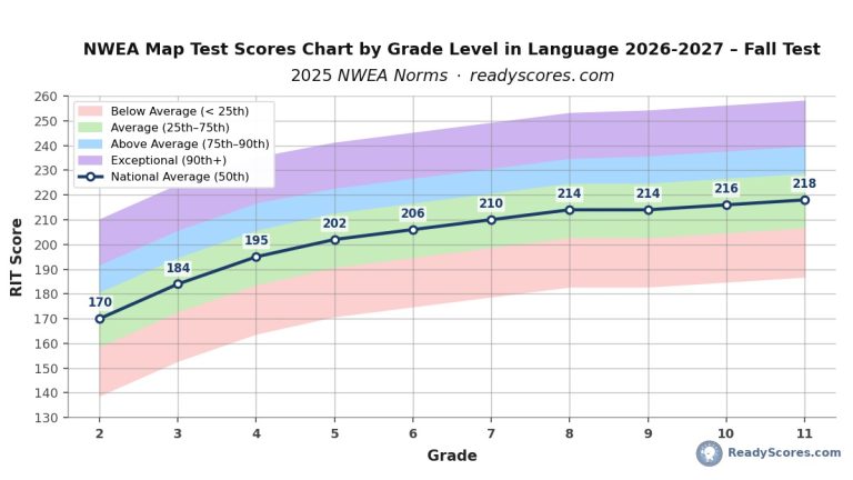
NWEA Map Scores Chart by Grade Level in Language (Quick Lookup)
NWEA MAP Math Scores by Grade Level (Full Percentile Chart)
NWEA MAP Science Scores by Grade Level (Full Percentile Chart)
NWEA MAP Reading Scores by Grade Level (Full Percentile Chart)
NWEA MAP Language Scores by Grade Level (Full Percentile Chart)
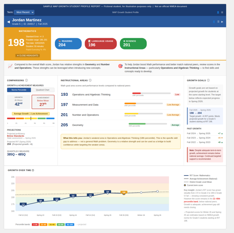
NWEA Map Growth Tracker – Free Tool
Map Score Calculator – What Does My Score Mean?
What is a Good Map Score?
My Child Scored Below Grade on the Map Test – What to Do?
NWEA Map Score Chart by Grade Level in Math 2026-2027 – Winter Test
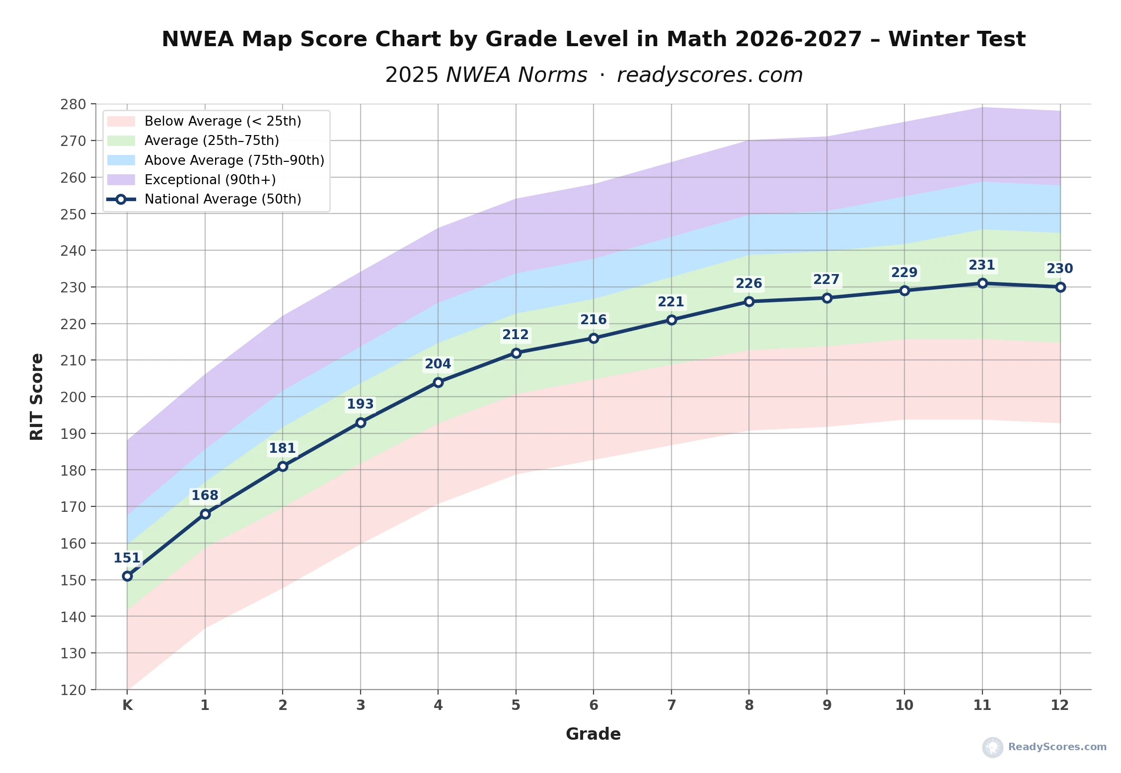
Winter testing runs in January and February, roughly the midpoint of the school year. Every band on this chart sits a bit higher than Fall, since students have had a semester to grow. Always check a Winter score against this Winter chart rather than the Fall one, since comparing a Winter score to Fall norms will make a normally progressing student look better than they actually are.
NWEA Map Scores Chart by Grade Level in Math 2026-2027 – Spring Test
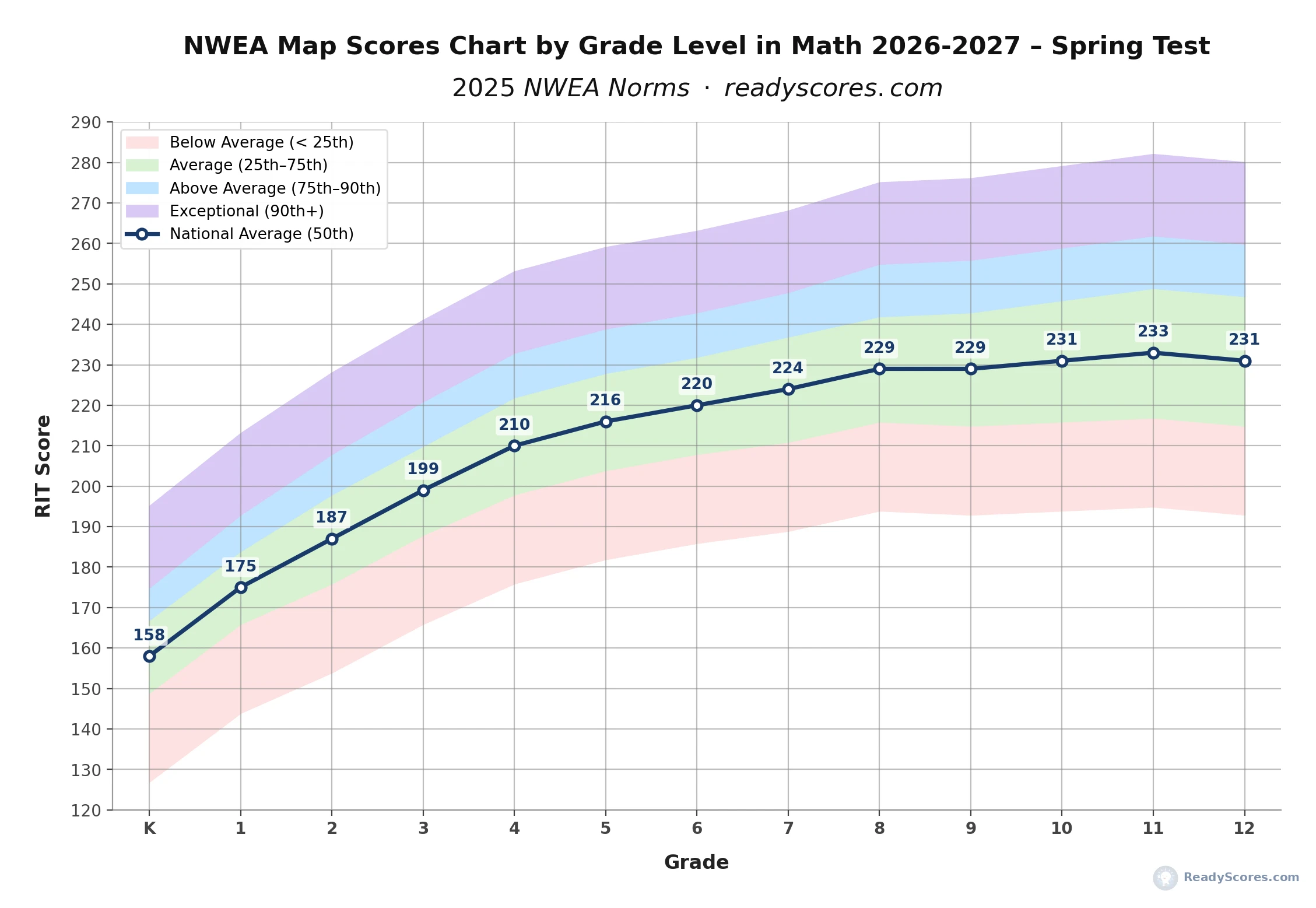
Spring testing happens in April and May and reflects a full year of learning, which is why every band here sits highest of the three seasons. This is the chart to use for end-of-year report cards and for judging whether a student’s yearly growth matched what’s typical for their grade.
NWEA Map Scores by Grade Level – Fall to Spring Growth Chart 2026-2027

NWEA Map Scores by Grade Level – Fall to Spring Growth Chart 2026-2027
This chart connects all three seasons into one continuous line, so you can see the national average score climb from Kindergarten Fall all the way to Grade 12 Spring. Look closely at the jump from Grade 5 Spring to Grade 6 Fall and you’ll notice a small dip rather than a rise. That’s a real pattern in the norm data, not an error. It reflects the well known summer slide combined with the jump into a new, harder math curriculum in middle school, and it’s completely normal.
Growth Chart Lookup: NWEA Map Scores by Grade Level – Fall to Spring Growth Chart – 2026-2027
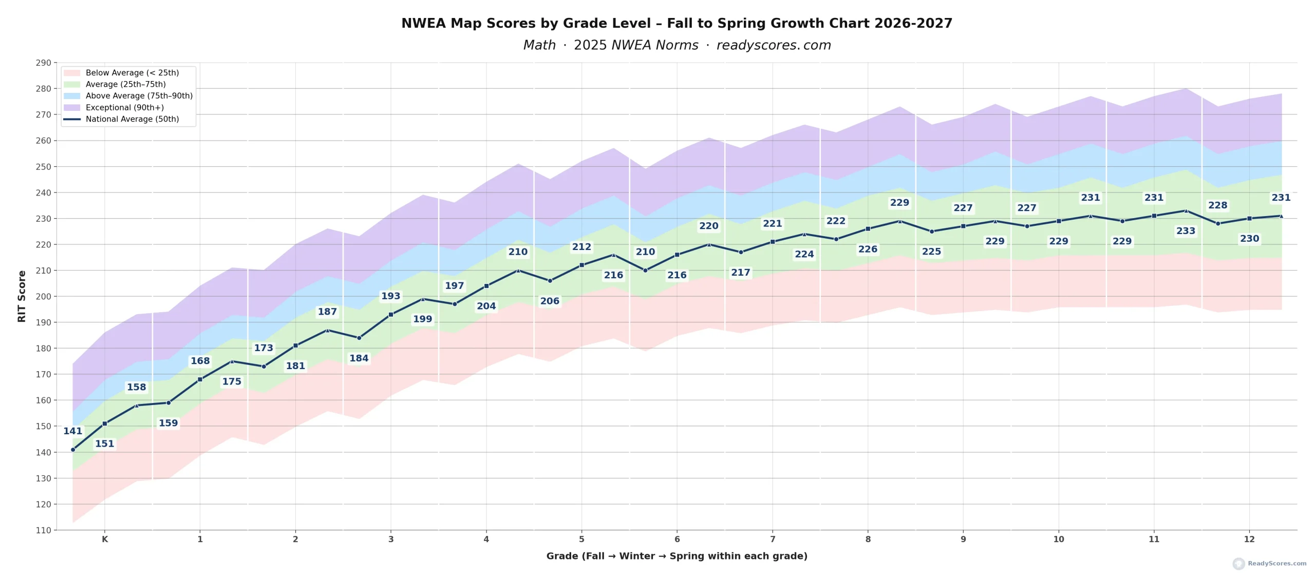
This chart strings every Fall, Winter, and Spring score together into one continuous line running from Kindergarten all the way to Grade 12, with the same four colored bands as the seasonal charts above so you can see the full spread of scores, not just the average, at every point along the way.
How to use it: find your child’s grade along the bottom, then look at the three points sitting above it, one for Fall, one for Winter, one for Spring, marked by a circle, square, and triangle. Each point has its RIT score labeled right on the line. Trace up from wherever your child’s score falls to see which colored band it lands in, the same way you would on any of the seasonal charts.
Why the line dips slightly at the start of almost every grade: look closely and you’ll notice the line drops a little every time it crosses from one grade’s Spring score into the next grade’s Fall score. This is a real, consistent pattern in the national data, not a chart error. Two things cause it: some typical summer learning loss between school years, and the jump into a new grade’s harder material, which the test picks up on immediately. It happens at nearly every single grade transition, so a small Fall dip is normal and expected, not a sign anything went wrong over the summer.
Why the line flattens out in high school: growth is steep in elementary school because every student follows the same grade-level math sequence. From around Grade 9 onward, students split into different course tracks, Algebra I, Geometry, Algebra II, Pre-Calculus, and the test score reflects an average across all of those different paths rather than one shared curriculum. That’s why the line climbs quickly through elementary and middle school, then levels off through the high school grades.
What the white vertical lines mean: each white line marks the boundary between one grade and the next, grouping every grade’s three testing seasons together visually. They’re there purely to help you quickly spot where Kindergarten ends and Grade 1 begins, and so on through Grade 12, without having to count points along the bottom axis.
What Is a Good NWEA Map Score in Math?
A good NWEA Map score in Math is any score sitting in the green band on the charts above, meaning it falls between the 25th and 75th percentile for that grade and season. A score in the blue band, above the 75th percentile, is well above average, and a score in the purple band, above the 90th percentile, is considered exceptional. A score in the pink band below the 25th percentile doesn’t mean something is wrong, but it’s usually worth a conversation with your child’s teacher about extra support.
Frequently Asked Questions
What is a good NWEA Map score in Math for 2026-2027?
A good NWEA Map Math score for 2026-2027 is any score at or above the 50th percentile for your child’s grade and testing season, which lands in the green band on the charts above. Scores in the blue or purple bands are above average to exceptional, based on the 2025 NWEA norms applied for both the 2026 and 2027 school years.
Why are there three separate Math charts instead of one?
Scores naturally rise across the school year, so a Fall score, Winter score, and Spring score for the same grade need different reference points to be read correctly. Comparing a Fall score against Spring norms would make a normally progressing student look behind, even if their score is exactly on track for that time of year.
How much should a Math Map score grow between Fall and Spring?
Typical growth ranges from about 8 to 17 RIT points across the school year, with the largest gains happening in Kindergarten through Grade 3. You can see this directly on the Fall to Spring growth chart above, where the line rises steeply in early grades and levels off through middle and high school.
Why does the growth chart dip slightly around Grade 6?
The small dip between Grade 5 Spring and Grade 6 Fall reflects real national testing data, not an error in the chart. It’s a combination of typical summer learning loss and the transition into a more demanding middle school math curriculum, and it evens out again as the Grade 6 school year progresses.
How do I use this chart if I only have one RIT score?
Pick the chart matching the season your child tested in, find their grade along the bottom, and see which colored band their score falls into. For an exact percentile rather than a band, the NWEA Map Score Calculator gives an instant precise result.
Where can I find the exact percentile numbers behind these charts?
The complete 1st through 99th percentile tables behind these charts are available on the full NWEA Map Math Scores by Grade Level page, which this quick lookup page is built from.
Explore more NWEA MAP score charts and tools:
Explore more NWEA MAP score charts and tools:
NWEA Map Scores Charts (by Grade) – Overview
NWEA Map Scores Chart by Grade Level in Math (Quick Lookup)
NWEA Map Scores Chart by Grade Level in Reading (Quick Lookup)
NWEA Map Scores Chart by Grade Level in Science (Quick Lookup)
NWEA Map Scores Chart by Grade Level in Language (Quick Lookup)
NWEA MAP Math Scores by Grade Level (Full Percentile Chart)
NWEA MAP Science Scores by Grade Level (Full Percentile Chart)
NWEA MAP Reading Scores by Grade Level (Full Percentile Chart)
NWEA MAP Language Scores by Grade Level (Full Percentile Chart)
NWEA Map Growth Tracker – Free Tool
Map Score Calculator – What Does My Score Mean?
My Child Scored Below Grade on the Map Test – What to Do?