NWEA Map Test Scores Chart by Grade Level in Science 2026-2027 (Quick Lookup)
Looking for the NWEA Map Science scores chart by grade for 2026-2027? This page has exactly that, and nothing you don’t need. Most NWEA Map score guides bury the answer under thousands of words and dense tables, but this NWEA Map Science score chart by grade level puts the number you’re looking for in front of you in seconds. Four charts, one glance each, and you know exactly where a Science score lands for any grade and any season, no scrolling required.
Note: NWEA MAP Science is only administered from Grade 2 through Grade 10, so these charts don’t include Kindergarten, Grade 1, Grade 11, or Grade 12.
NWEA Map Test Scores Chart by Grade Level in Science 2026-2027 – Fall Test
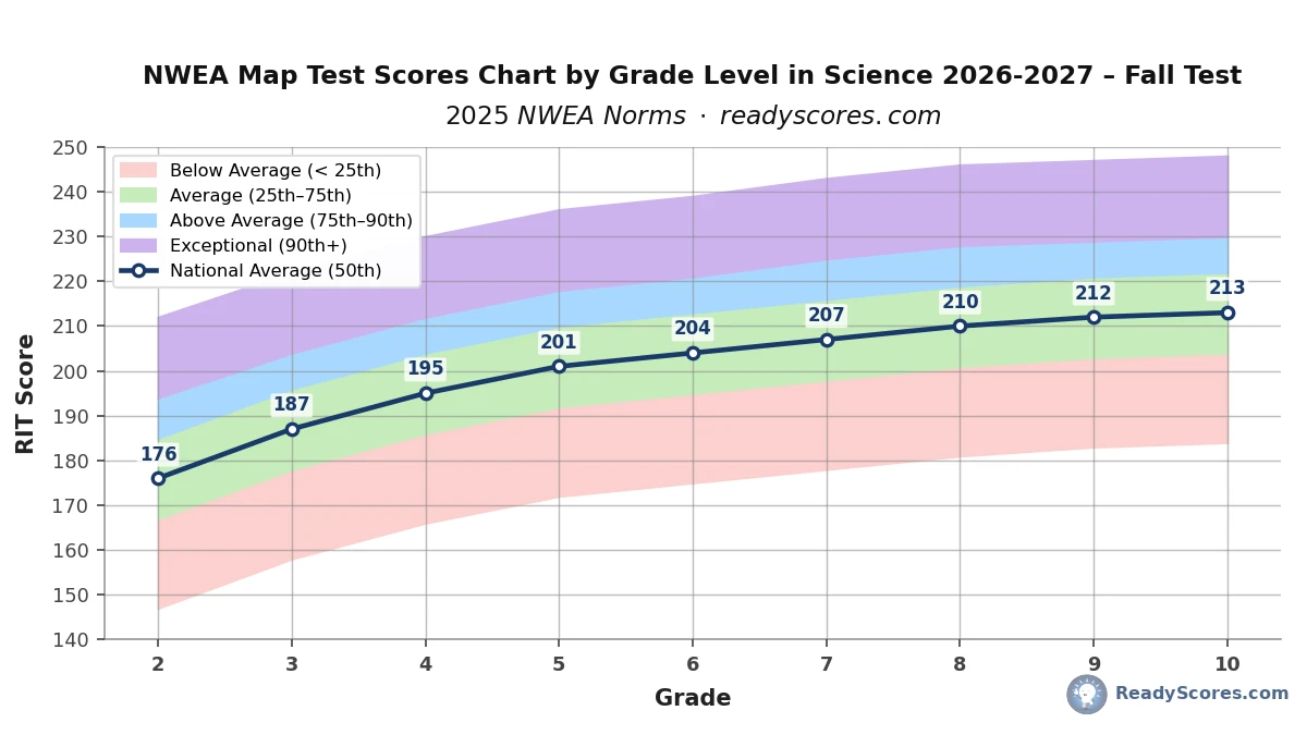
Fall testing happens in September and October, so this chart marks the starting point of the school year. Find your child’s grade on the bottom axis, then look straight up to see where their score lands against the four colored bands. Landing in the green band means an average score, blue or purple means above average, and pink means the score sits below where most students in that grade tested this Fall.
NWEA Map Score Chart by Grade Level in Science 2026-2027 – Winter Test
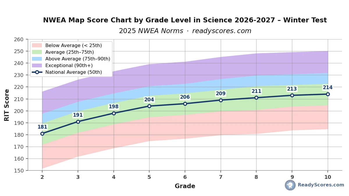
Winter testing runs in January and February, roughly the midpoint of the school year. The gap between Fall and Winter is smaller here than on the Math or Reading charts, since Science RIT growth is naturally more modest across every grade. Always check a Winter score against this Winter chart rather than the Fall one for an accurate read.
NWEA Map Scores Chart by Grade Level in Science 2026-2027 – Spring Test
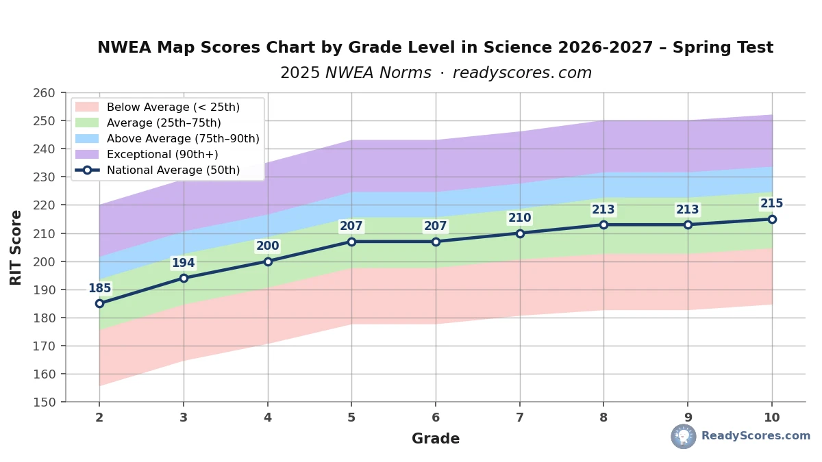
Spring testing happens in April and May and reflects a full year of science learning, which is why every band here sits highest of the three seasons. Even so, the overall climb from Fall to Spring is gentler than in Math or Reading, which is normal for how Science MAP scores develop.
Full Year Growth – NWEA Map Scores by Grade Level – Fall to Spring Growth Chart 2026-2027
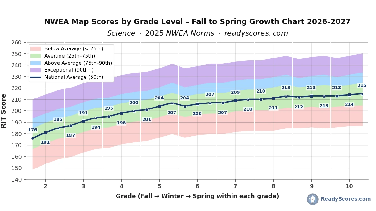
This chart strings every Fall, Winter, and Spring Science score together into one continuous line running from Grade 2 to Grade 10, with the same four colored bands as the seasonal charts above so you can see the full spread of scores, not just the average, at every point along the way.
How to use it: find your child’s grade along the bottom, then look at the three points sitting above it, one for Fall, one for Winter, one for Spring, marked by a circle, square, and triangle, each labeled with its RIT score. Trace up from wherever your child’s score falls to see which colored band it lands in, the same way you would on any of the seasonal charts.
Why the line is flatter overall than the Math or Reading growth charts: Science concepts tend to get revisited across grade levels rather than building in a strict straight line the way arithmetic or phonics skills do, which produces smaller, steadier RIT gains year over year. Typical growth is around 3 to 9 points per year in elementary grades, slowing to 1 to 3 points by Grades 8 through 10, and that gentler climb is visible across the whole chart.
Why the chart starts at Grade 2 and stops at Grade 10: NWEA MAP Science is only administered from Grade 2 through Grade 10. Science instruction in Kindergarten and Grade 1 is typically exploratory rather than standards-based, and by Grade 11 most students have moved into course-specific science classes like Biology, Chemistry, or Physics, which fall outside the general MAP Science scale.
What the white vertical lines mean: each white line marks the boundary between one grade and the next, grouping every grade’s three testing seasons together visually. They’re there purely to help you quickly spot where one grade ends and the next begins, without having to count points along the bottom axis.
What Is a Good NWEA Map Score in Science?
A good NWEA Map score in Science is any score sitting in the green band on the charts above, meaning it falls between the 25th and 75th percentile for that grade and season. A score in the blue band, above the 75th percentile, is well above average, and a score in the purple band, above the 90th percentile, is considered exceptional. A score in the pink band below the 25th percentile doesn’t mean something is wrong, but it’s usually worth a conversation with your child’s teacher about extra support.
Frequently Asked Questions
What is a good NWEA Map score in Science for 2026-2027?
A good NWEA Map Science score for 2026-2027 is any score at or above the 50th percentile for your child’s grade and testing season, which lands in the green band on the charts above. Scores in the blue or purple bands are above average to exceptional, based on the 2025 NWEA norms applied for both the 2026 and 2027 school years.
Why does NWEA MAP Science only test Grades 2 through 10?
The assessment framework aligns to Next Generation Science Standards grade bands, and most schools begin formal science MAP testing in Grade 2 rather than Kindergarten or Grade 1. By Grade 11, students typically move into course-specific science classes that fall outside the general MAP Science scale, which is why the charts on this page stop at Grade 10.
Why is Science growth slower than Math or Reading growth?
Science curricula tend to revisit the same core concepts across multiple grade levels rather than building in a strict linear sequence, which produces smaller year-over-year RIT gains. This is a reflection of how science is taught, not a sign the test is harder, and it’s clearly visible as the gentler slope on the growth chart above.
Why are there three separate Science charts instead of one?
Scores naturally rise across the school year, so a Fall score, Winter score, and Spring score for the same grade need different reference points to be read correctly. Comparing a Fall score against Spring norms would make a normally progressing student look behind, even if their score is exactly on track for that time of year.
How do I use this chart if I only have one RIT score?
Pick the chart matching the season your child tested in, find their grade along the bottom, and see which colored band their score falls into. For an exact percentile rather than a band, the NWEA Map Score Calculator gives an instant precise result.
Where can I find the exact percentile numbers behind these charts?
The complete 1st through 99th percentile tables behind these charts are available on the full NWEA Map Science Scores by Grade Level page, which this quick lookup page is built from.
Explore more NWEA MAP score charts and tools:
NWEA Map Scores Charts (by Grade) – Overview
NWEA Map Scores Chart by Grade Level in Math (Quick Lookup)
NWEA Map Scores Chart by Grade Level in Reading (Quick Lookup)
NWEA Map Scores Chart by Grade Level in Science (Quick Lookup)
NWEA Map Scores Chart by Grade Level in Language (Quick Lookup)
NWEA MAP Math Scores by Grade Level (Full Percentile Chart)
NWEA MAP Reading Scores by Grade Level (Full Percentile Chart)
NWEA MAP Language Scores by Grade Level (Full Percentile Chart)
NWEA Map Growth Tracker – Free Tool
Map Score Calculator – What Does My Score Mean?
My Child Scored Below Grade on the Map Test – What to Do?